Basic Bollinger Bands Squeeze Indicator
Platform: MT4 Type: Momentum Last update: September 21, 2024The Basic Bollinger Bands Squeeze Indicator for MT4 is an interesting combination of three well-known elements: Momentum, Bollinger Bands and even Kelter Channel. It’s displayed within seperate window placed below the main trading chart. When it comes to anatomy, it consists of colorful bars and horizontal dots. Let’s have a closer look at it and how to interpret these readings.
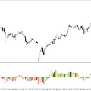
Below you can this gauge in action.
The main goal of the tool is serving clear visual clues and information regarding market’s volatility, momentum, and potential price shifts. What’s more it was designed to have well-balanced sensitivity for ongoing price action changes. In the result, it responds to them rather quickly and provides updated view on the situation.
Is there any meaning of these colored histogram bars?
Of course, each color has specific meaning and it’s in relation to neutral zero level. The purpose is measuring the strength and direction of the trend and it can be desribed as follows:
- When momentum rises above the zero line, it is represented by darker green.
- If momentum falls above the zero line, it is denoted by lighter green.
- Rising momentum below the zero line is indicated by darker red.
- Falling momentum below the zero line is shown as lighter red.
Besides that great feature of volatility measure, it has these points at zero level that carry significant role. In fact, they reflect the current and past relationship between the BB and the keltner – namely:
- Red points corresponds to setup where the bands are outside the channel, suggesting a strong trending market.
- Blue dots corresponds to scenario where the bands are inside the channel, indicating a flat and sideways movement.
Trading strategy with basic bollinger squeeze
The core idea behind this indicator is knowingly identify, categorize and utilize specific market phases. First, take a consolidation stage represented by blue dots and then, in order to enter a trade, look for a breakout when dots change to red bringing the start of a trending phase. The histogram provides reliable insights and gives good guidance on when to consider exiting a trade as the trend weakens.

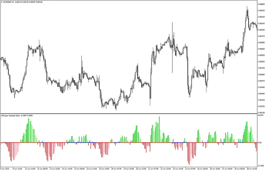
Let’s dive into example trade above.
As you can see, we have added 100-period exponential moving average to confirm further our technical analysis. The concept applied here is trading only in the direction of overall trend, which is bullish.
Once aware of bias, for the next step one should have spotted switch of neutral-level dots from blue to red. Finally, histo bars should be green. The moment when checklist is completed is marked in the red circle. If the long trade was then opened, it would result in a great profit as powerful upward impulse happend.
Conclusion
This gauge was created to gain thanks to volatility and price fluctuactions. It helps to differ between choppy market and robust trend. While its efficiency is nto bad, it can be increased further by onboarding additional tools.