Synthetic VIX Indicator
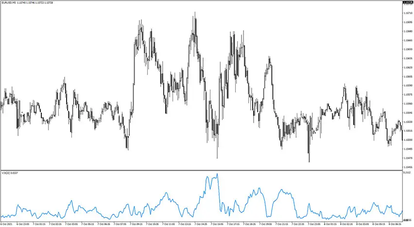
Platform: MT4 Type: Volatility Last update: October 16, 2024The Synthetic VIX Indicator for MetaTrader 4 is a volatility measure gauge. Its name stands for Synthetic Volatility Index indicator and it helps traders in their technical analysis and in planning their trades in the context of favorable and unfavorable market conditions.
Closer look on the Synthetic VIX Indicator
The purpose of the Synthetic VIX Indicator is to monitor price action changes that are used for calculating the volatility index. That volatility index serves as a scale that determines the price volatility levels. Originally, the indicator was developed to track the volatility level of the S&P 500 and later on, it was updated to make it compatible with other financial assets.
Why should a trader be interested in tracking volatility before trading decisions? Volatility refers to how frequently the price of a currency pair changes. The higher the volatility level, the higher the risk of trading such pairs because sharp price moves are most probably underway. Of course, there are situations, where a trader intentionally trades high-volatility pairs, but it’s based on an according strategy in such a scenario.
Formula used to calculate market volatility
In order to calculate market volatility, the Synthetic VIX Indicator uses historical data from previous sessions. Namely, it applies a 22-period Moving Average to estimate the market volatility level of a currency pair. The exact formula is the following:
Synthetic VIX value = [{Highest(Close,22) – Low}/{Highest(Close,22)}]
Let’s explain it. First, it takes the value of the highest close price of the last 22 bars and then subtracts the current bar’s low. Then, it divides the result by the value of the highest close price of the last 22 bars. In the end, the result can be multiplied by 100 to scale the indicator readings (if required).
Example charts
Check charts of the Synthetic VIX Indicator in action.
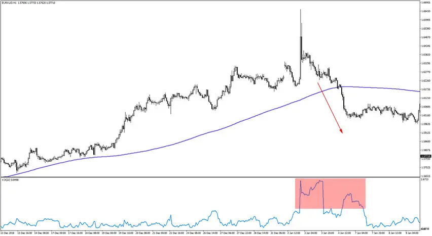
On the left side of the chart, we can see a clear uptrend and stable volatility. Later on, volatility shoots up (marked in the red zone), and then the price falls, breaking the moving average. In this example increase in volatility resulted in a change of the trend direction.
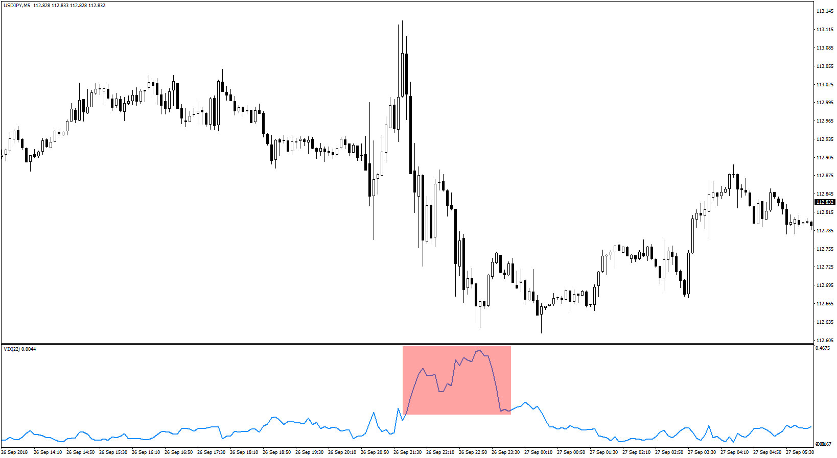
In this example, on the left and on the right, we can see relatively stable volatility. However, in the middle of the chart, there is a big change in volatility, resulting in huge swings of the price – first to the top and then to the bottom.

In the above chart, we can see two areas of volatility increase. The first one is a single big candle (very likely an important economic news occurred). The second red area corresponds with the meaningful fall of the price.
Settings
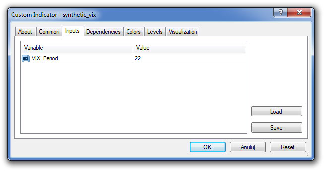
These are available settings.
Submit your review | |

